
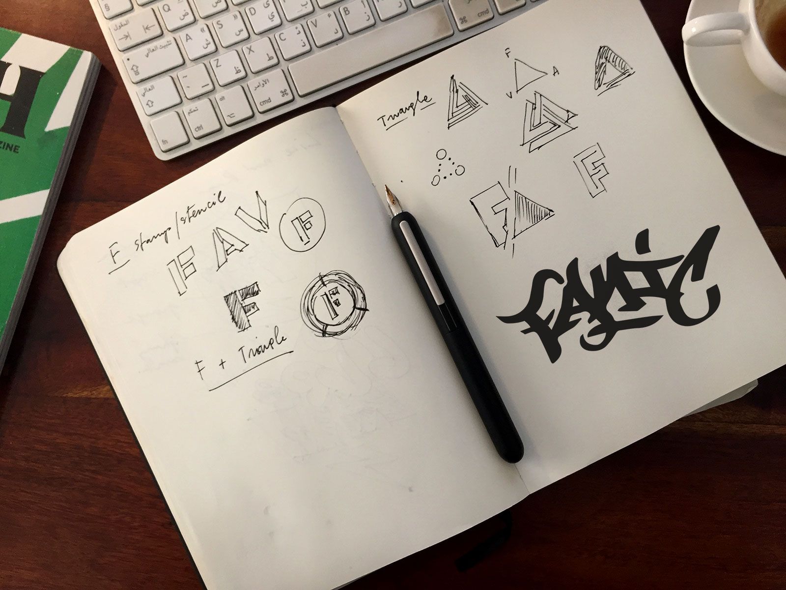
In 2013 when the idea for Fanic emerged I started the first tryouts for the logo. Fanic music was originally intended for Fans, Artists, and Venues. A triumvirate of three user entities would have a functional need for such a tool. An obvious route was the triangle. A triangle is traditionally the symbol of change, of a doorway to something else. Something new.
After that, I tried out something with the F as a sign or a brand. A stenciled F. I could maybe also use stencil characters in the icons for the app.
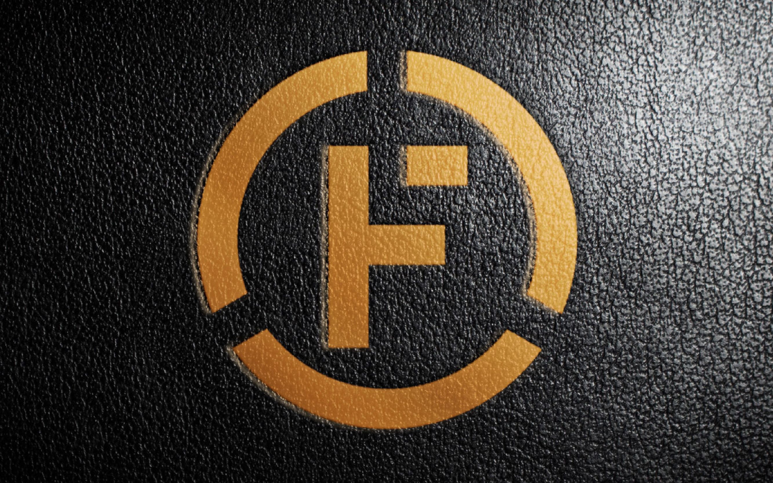
In the end, I still had the triangle in the circle divided into three parts and came up with the orange-colored F inside the broken circle as it is now.


© 2017 – Fanic Music Corporation – All Rights Reserved